
When executives and data analysts think data analytics, the vision that likely pops into their heads is an executive dashboard. An executive dashboard is a collection of metrics and trends that shows the current state of a department, an initiative, or an organization overall. A common analogy is an airplane’s cockpit array (which have also improved dramatically). When used effectively, Dashboards can be invaluable in identifying changes, monitoring progress, timely decision-making, and even strategic planning.
John Egan, Growth Engineer at Pinterest, believes that it is critically important to only track metrics that you are going to use. He says, “Don’t build metrics that aren’t going to be part of your day-to-day operations or don’t have potential to be incorporated as such. Building reports that no one looks at is just activity without accomplishment and is a waste of time.”
Our Nucleus solution allows organizations to quickly build executive dashboards. Each association can select which metrics and trends to present in a dashboard (or series of dashboards) and decide which groups of users are afforded access to which views. Currently, these key metrics and trends are grouped together into a key indicators carousel and presented to the users with a typical carousel scroller (see image #1). The most common metrics to be included are member retention, new member acquisition, conference registration trends, revenue and expense trends, and progress against strategic goals – but dashboards are customized for different roles and departments and all are unique. The dashboard can have 1 to n number of data cards in the dashboard carousel.
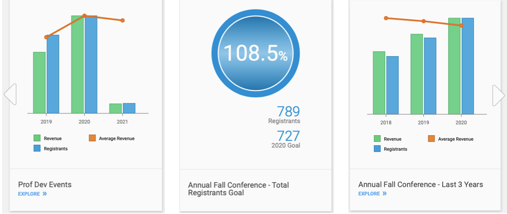
Recently we added a second presentation interface to Nucleus for displaying key metrics and trends. We have added a more classic executive dashboard style with all the metrics displayed on a single screen (below). Like the original carousel interface, each organization can select which metrics and trends to add to the executive dashboard:
Candidly, we have been somewhat reticent to add this traditional dashboard view because this interface generally displays poorly on mobile devices. The entire Nucleus system is responsive, meaning it has been intentionally architected to render as clearly on a mobile phone as on a desktop web browser – and we did not want to sacrifice this foundational principle of the platform. But for the convenience of “starting one’s day with coffee and a dashboard”, the Nucleus R&D team now offers our users with the best of both worlds! Through some clever programming, we can provide the classic dashboard interface to the desktop and tablet users, and then elegantly switch to the carousel data card view to present the information to mobile users.
Parting thought
As with all Nucleus features, these new executive dashboards can be used to provide relevant and tailored insights throughout your organization. For example, dashboards focused on different operational areas such as Membership, Certification, Events (or perhaps one important event in particular, such as an Annual Conference) can be established for each department. Executive dashboards also can provide specialized views for your board members, committees, and chapters. Another use case is embedding dashboards in your website – something we like to call Member Facing Analytics – to provide timely and clear information to your members.
As we say at Gravitate, Data Analytics for Everyone!